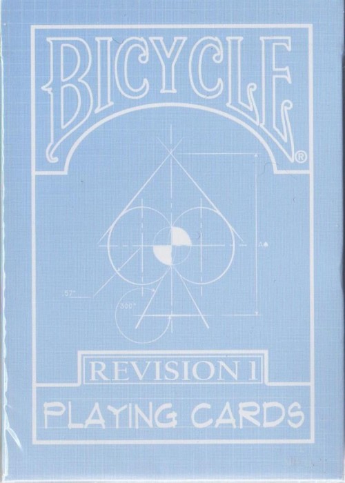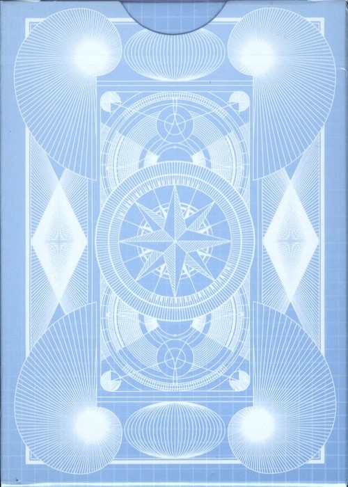
During the V7 design process, Daniel Schneider, showed me the final render of the inside of the V7 box. I was so blown away by how 80’s it looked. My wife Holly said That should be it’s own deck. I thought about it for a while and it just made too much sense not to do. I knew the parallel universe concept had to be used here, which is why they were dubbed the Parallel Edition. So, Daniel and I got to work and adjusted this to so it made sense as a back design. We had a think tank session that lasted around 4-5 straight hours. From there we did a few minor adjustments throughout the following week or so. The outside of the V7 box is the inside of the V7p box. Throughout the deck of the V7p’s you’ll find some things have been changed/flipped from the V7 to further highlight the fact that you’re now in a parallel universe. We’ll let you search for them. The matte lavender color that replaced the red cards give a softer tone while pairing nicely with the dark purple icons on the back design.
Views 4
Product Name
Orbit
Edition
V7 Parallel
Brand
—
Producer
Release Year
Artist
Gilded
—
Gilding Color
—
Signed
—
Numbered
—
Seal Embellishments
—
Magic
—
Production Run
Card Genre
Card Back
Courts
Tear Strip
—
Jokers
—
UPC
—
Card Embellishments
—
Card Construction
—
Box Embellishments
—
Box Construction
—
Card Stock
—
Finish
Colors
—
Theme
—
Stay up-to-date