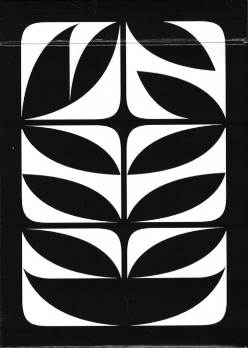
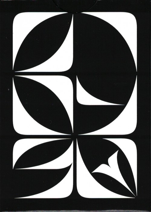
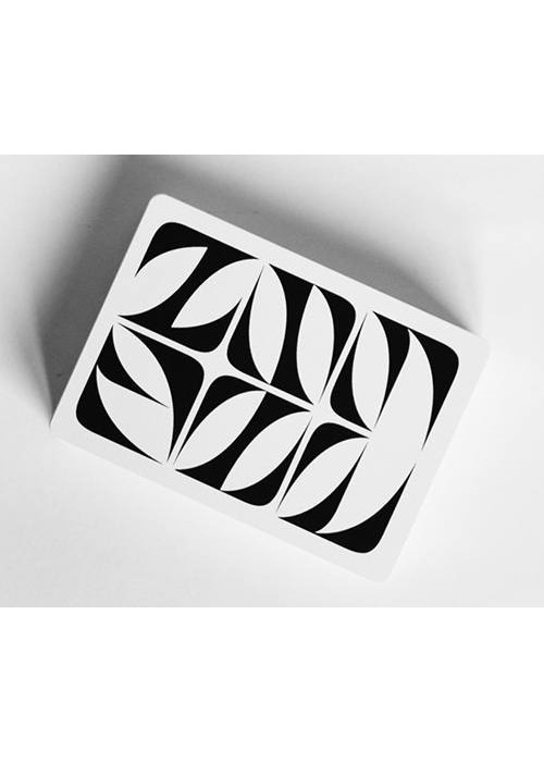
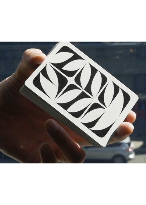
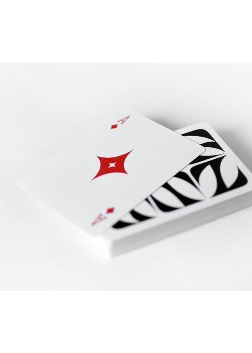
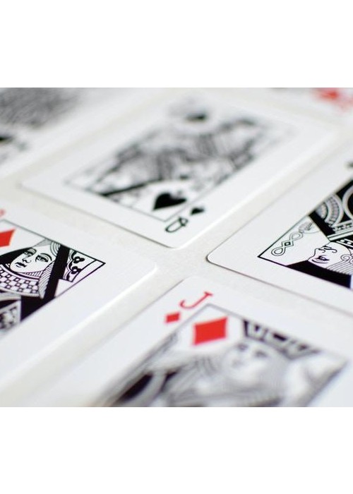
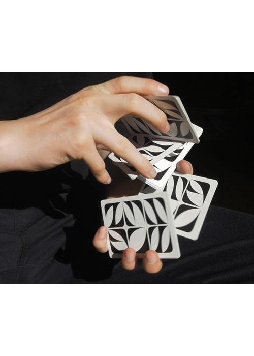
The overarching idea for this deck design was to create a direct comparison between all the different permutations of glyph combinations, and the endless amount of possibilities a deck of cards offers us. This design was born from a deep interest in typography and the search for unconventional typefaces that push the boundaries of form, with the goal of creating a deck design that challenges the preconceptions of what a deck of cards can look like. The typeface used as building blocks for this deck was designed by my friend, and talented French type designer, Charles Quirouard. From there, I adjusted its curves, proportions, and specific dimension to properly fit my vision for this design. The moment I began experimenting with his typeface I realized it would look great as a back design. This quite abstract typeface has many beautiful moments that I wanted to highlight, but I couldn’t include all 26 letters of the alphabet in one back without it feeling cluttered and chaotic. That’s when the fitting decision of making a deck with 56 different back designs surfaced.